2019 humans are now able to have a general view of their menstrual cycles and health. Clue is not intended to be a substitute for medical consultation, but it can make our life easier by offering us the right info at the right time. I’d like to see a tool that offers us simplicity of use, non-intrusive advice and accompaniment, reliable educative informations, intelligent useful features (such as forecasts, digests, alerts) all of that delivered with clean, straightforward UI. Clue has been doing this for a few years now but maybe it has room for improvement.
Disclaimer : this does not include researches about any premium features.
The majority of the -yet clever- features are underused and could be more effectively thought out. Why ?
I tried to solve those problems by :
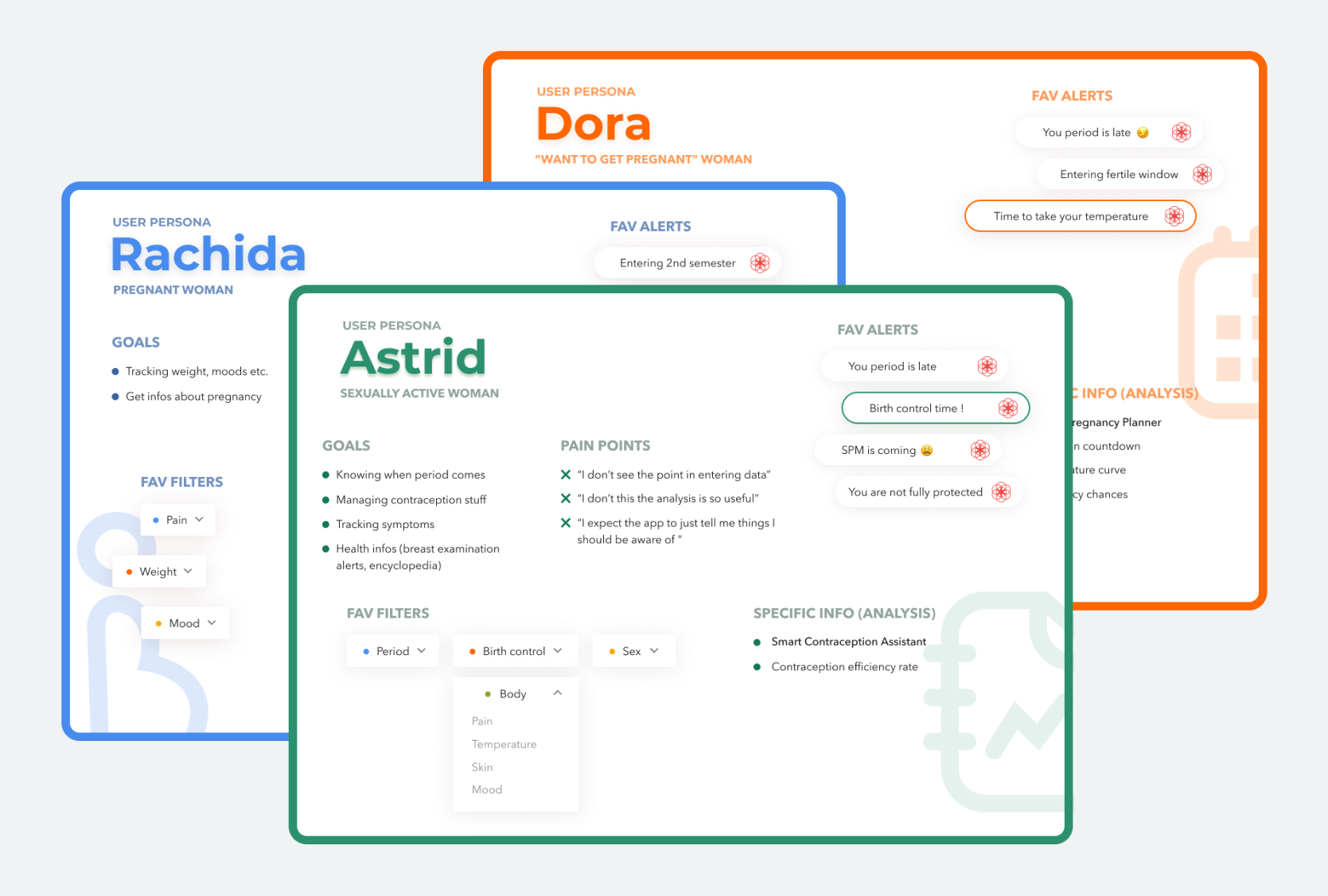
I ended up working around the experience of 3 personas, based on my own experience and the Play Store users experience. Astrid is the one we’re going to follow until the end of this case study. She's a sexually active woman that doesn’t want to get pregnant. She’s taking birth control and uses Clue to keep track of her cycle, health and basically, she expects to just be notified when something’s wrong. The two other personas are a pregnant woman, and a woman who wishes to get pregnant. You could easily see why they would have very different uses of the app (especially the pregnant woman whose menstrual cycle is completely disrupted).
Obviously, the goal here is not to create 3 different apps for 3 different women. I’m rather going for a single mutual app, like a common core around which several “secondary” features would be offered to users after we got to know them better.
But how do we do that ?
Existing screens : here’s what the sign up journey on Clue currently looks like.
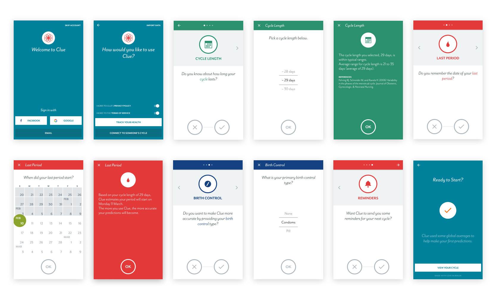
I get that not everybody is willing to spend 3mn+ on an app, giving personal informations, especially at this early stage, when the user has just signed up and wants to play with the app a little bit. So, since the journey is going to be extended anyway, I thought it could be a good idea to add a little “save” element so the user can leave the app anytime without losing all progress.
The user can now pick the right profile for them. This choice is going to affect the rest of the journey by making suggestions to the user, preselecting categories, and educating them into a better knowledge of the app features. This is especially featured in the two all-green illustrated screens with swipeable cards. The common core is represented by the first “health tracker” card, and then there’s the “contraception assistant”, specific to the user’s profile.

I chose to keep the visual structure (yes/no answering type of form) and the initial colors of the first onboarding journey. Also, you can still navigate the different tabs with the top arrows. The goal here is to make the user feel safe, they must not have the feeling of being lost in all of this. Short messages are here to reassure the young user and to give informations about the content. Users that don’t know much about contraception or that don't feel involved in this should not feel overwhelmed.
The alert/reminder tab has been upgraded. With the customization, the user gets presets based on their profile. Astrid's alerts, for example, are mainly about period and contraception. Remember how we said she expected the app to notice her when something’s wrong ? Now, Reminder and Analysis work together to tell Astrid when she’s been having a risky behaviour ; such as having unprotected sex the same day she forgot to take her pill and is in the middle of her fertile window ! This is typically the kind of useful application Clue could make of the data it’s collecting. It’s getting back to the user, who will, in response, continue to update their “profile” daily.
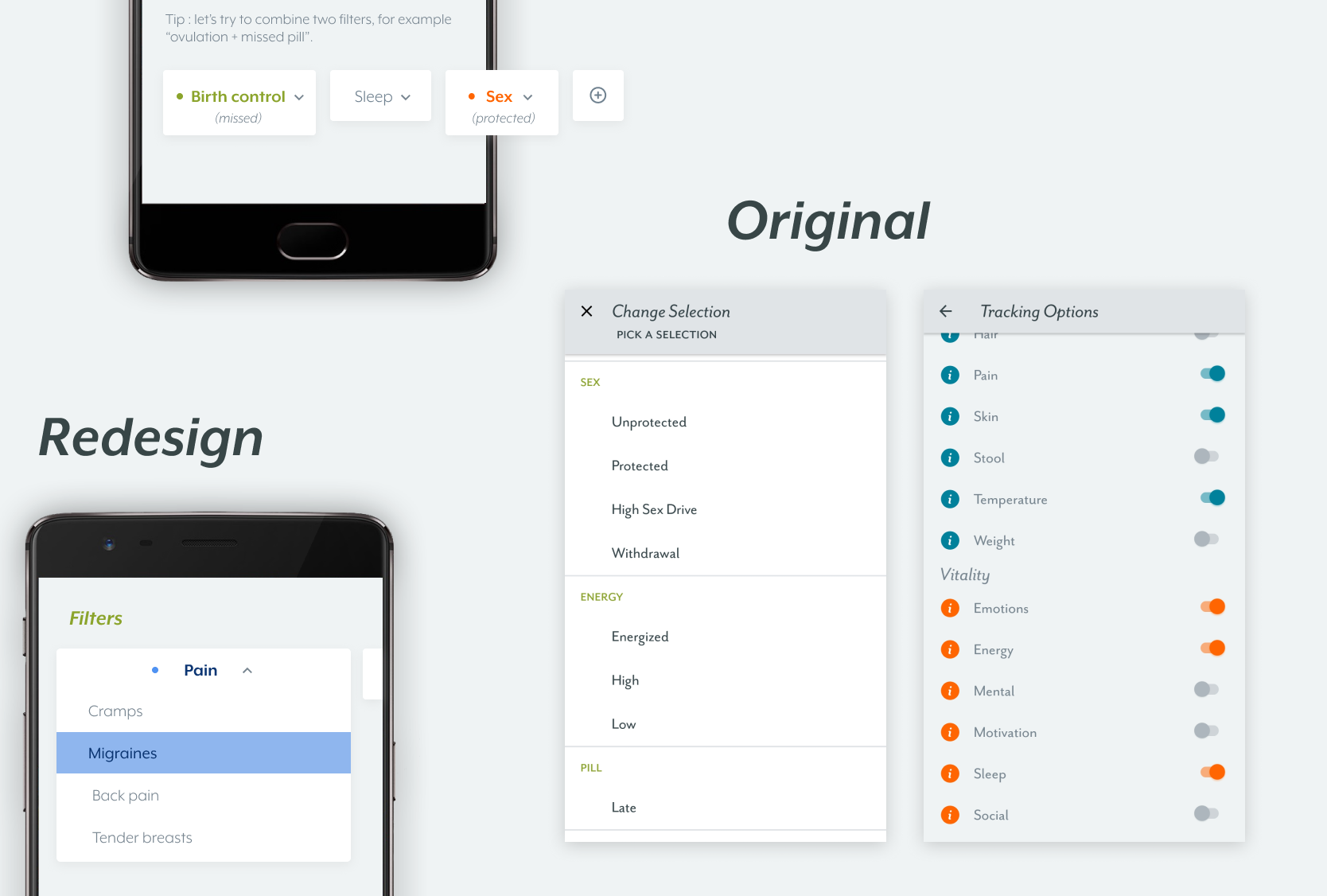
Finally, the categories tab allows the user to pick which elements they needs to keep track of. Again, not every human needs to keep track of their back pain, body temperature, or acne. I redesigned the aspect of the categories picker to make it feel lighter and more simple-looking. Also, you can get a quick overview of a broad range of categories without having to read them all. Just pick what feels relevant to you.

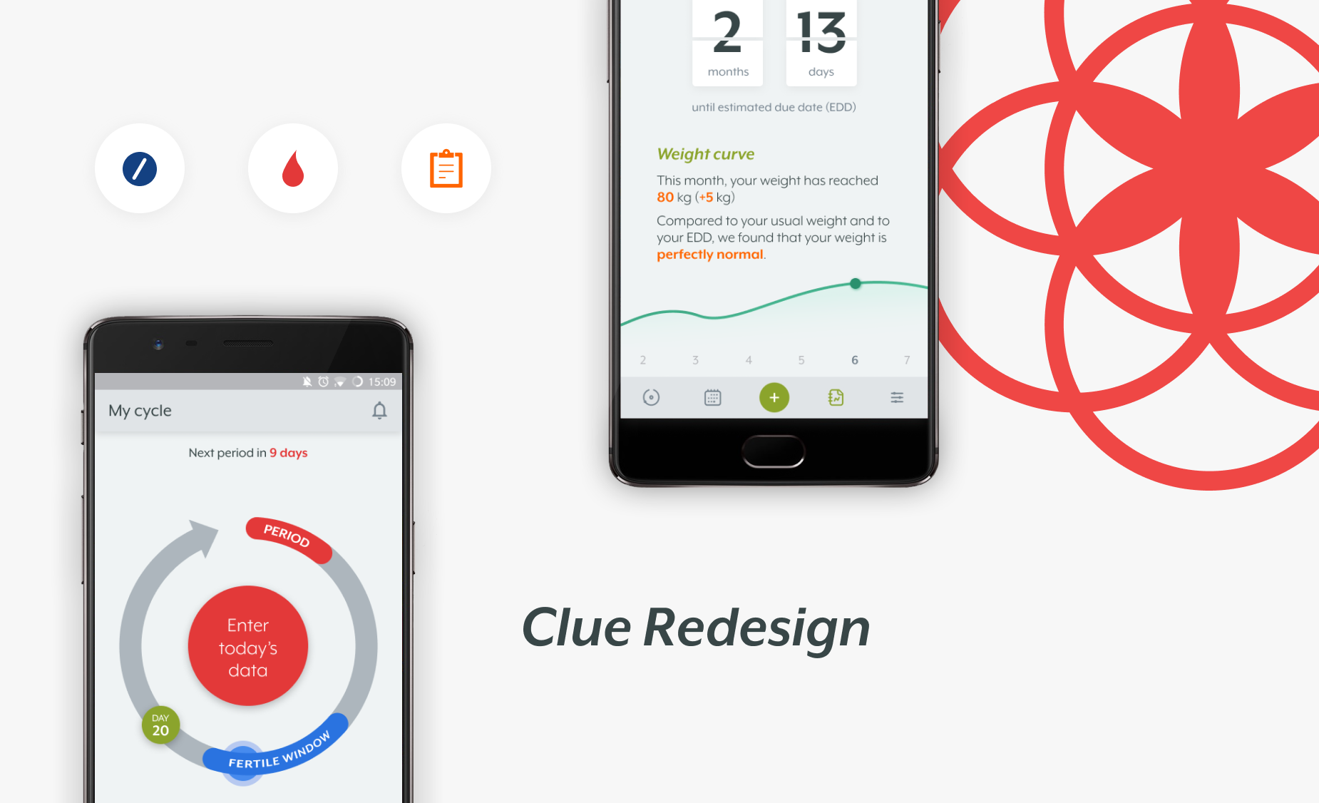
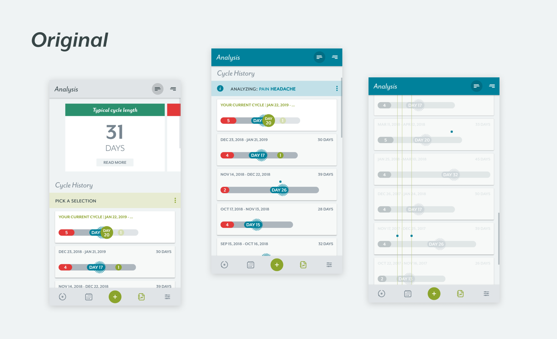
The calendar, as known as the “today” screen. The point of the current design is to allow the user to see instantly their current, past and future cycles, with periods and fertile windows. Days are designed with boxes, within which square represent a data the user filled in that day. You can see all of that very quickly. Problem is, in real life, you don’t necessarily know what these colored squares are representing. You don’t see quickly enough what month it is. The date indicator indicates a cycle day (day 20) that doesn’t match the calendar real days.
What I tried to achieve with this screen was to keep quick general overview but make it breathe a little. So now, the two things you now see right away are your period and fertile window, this month. So the period+ovulation filters are automatically enabled, but you can disable it if you want to, to focus on other things like filters.
But because sometimes, you need a more general view, and because cycles don’t follow our month rules, I created another view, in which you can also predict your next cycle.
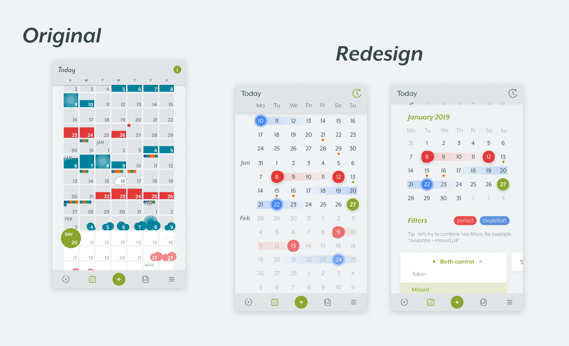
Thanks to our new onboarding, you already know how the filters/categories work, so let’s try it ! Users can now quickly track, let’s say the day they missed their birth control pill and associate it to the days they had unprotected sex. One other thing about the categories : you now can modify your favorite categories right on this screen, while you’re actually using it. This feature, in the current app, is quite hidden in the setting so I meant to improve its accessibility.
When I started working on the Analysis, I realized I’ve been on this screen before, many times, but I’ve never used it really. What this tool really does, is allowing you to track symptoms, and to visually link it to your cycle. In short, you have to do all the work. Symptoms are displayed in the form of little squares, emphasised during scrolling. This tool could be great, but I feel like the app is relying on the user too much to go and track things without giving any guidance.
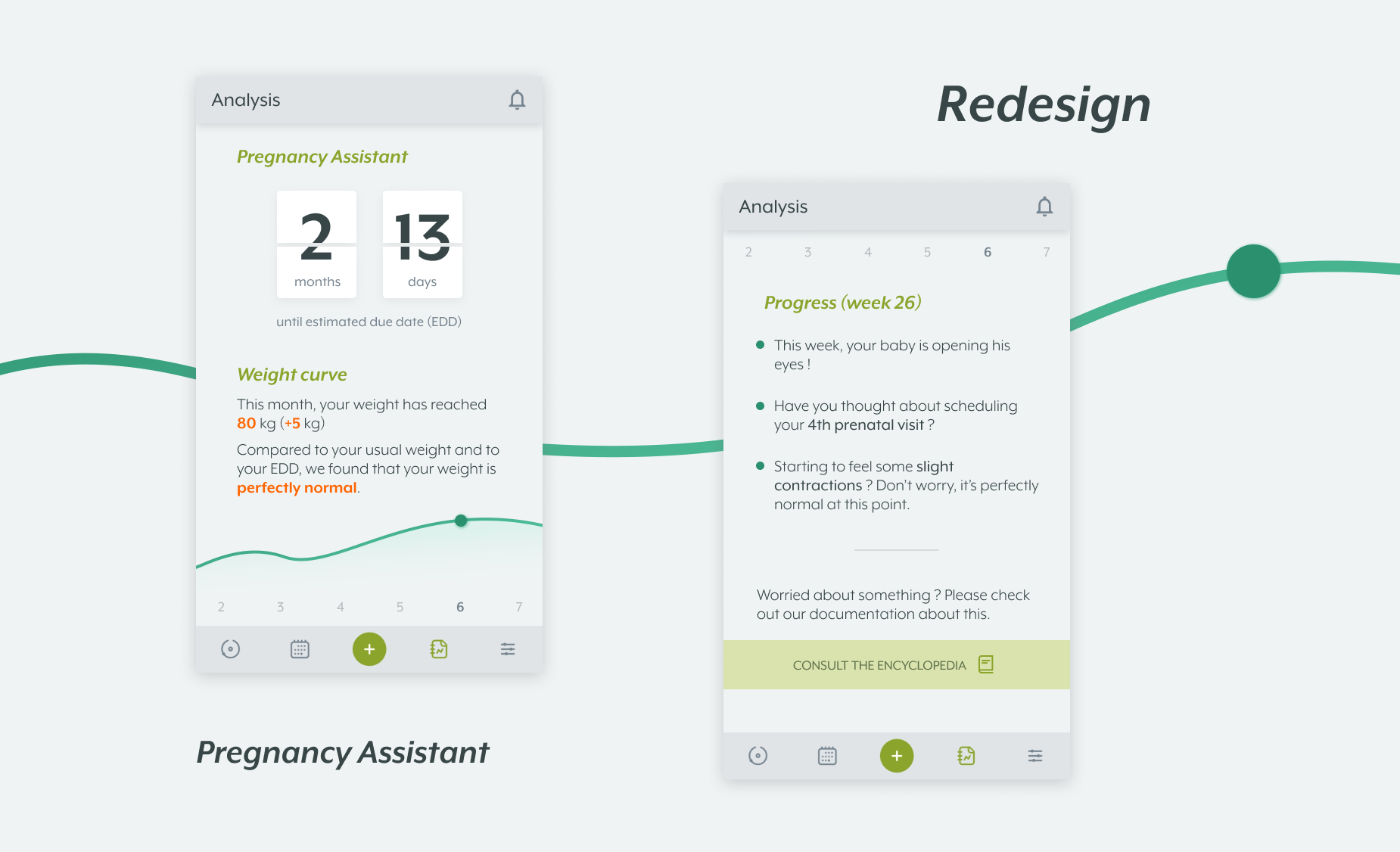
In this version, Clue is giving the user a head’s up about what’s to come, what’s going on in their body at this time of the month. The goal was to give some real value to the analysis by giving the user capital informations about their health, but in very simple terms (sometimes involving graphs and visual content).
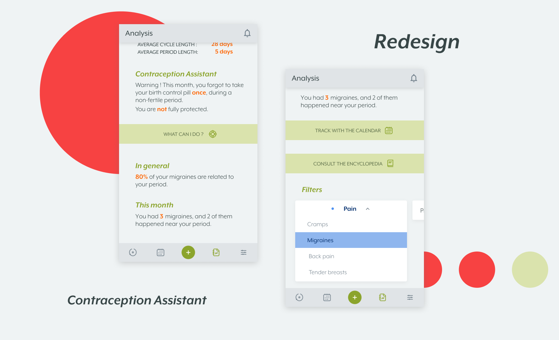
Clue has detected that Astrid used a contraception and wasn’t planning on getting pregnant any time soon. This smart Contraception assistant is telling her whether she's protected or not, based on many things. It could be based on how conscientiously the user took their birth control (did they take it too late, were they sick ?), it could be related to the contraception’s initial effectiveness, etc. If the user is not fully protected, Clue is offering them to consult the Encyclopedia’s most useful sections about this specific issue (once again, not replacing doctors but giving hints about whether you should worry or not).
So, tracking. Let’s take migraines for example. They are now automatically associated to the user's menstruations so they now can find out, in a few seconds, if the pain they experience is related to the cycle or not. The same “info buttons” system is used here, with now the ability to redirect to the Calendar with the settings the user has selected previously. My goal was really to highlight the Encyclopedia feature: offering reliable content to the users in a smart way. Another highlighted feature : the reminders. The user can now access their alert preferences from many screens by touching the little bell icon.
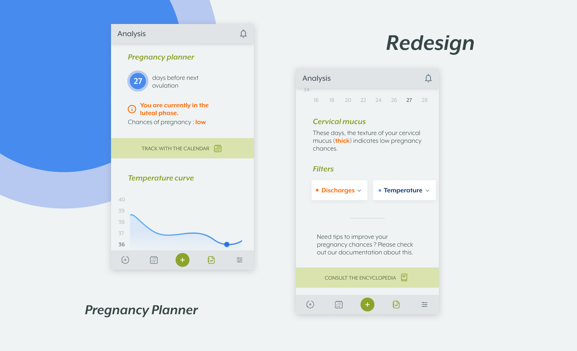
Here is what the other profiles’ analysis look like. Same goal, we want the user to find most important informations, specific and relevant to his profile, right away. We still observe a common core (each of the 3 users are able to track symptoms with filters) along with specific content (pregnancy planner, pregnancy assistant, contraception assistant).
To wrap up this case study, I’d say that I really enjoyed working on this personal project of redesign. I really look forward to see improvements in the future, as smart technologies continue to allow us improving our health tracking.